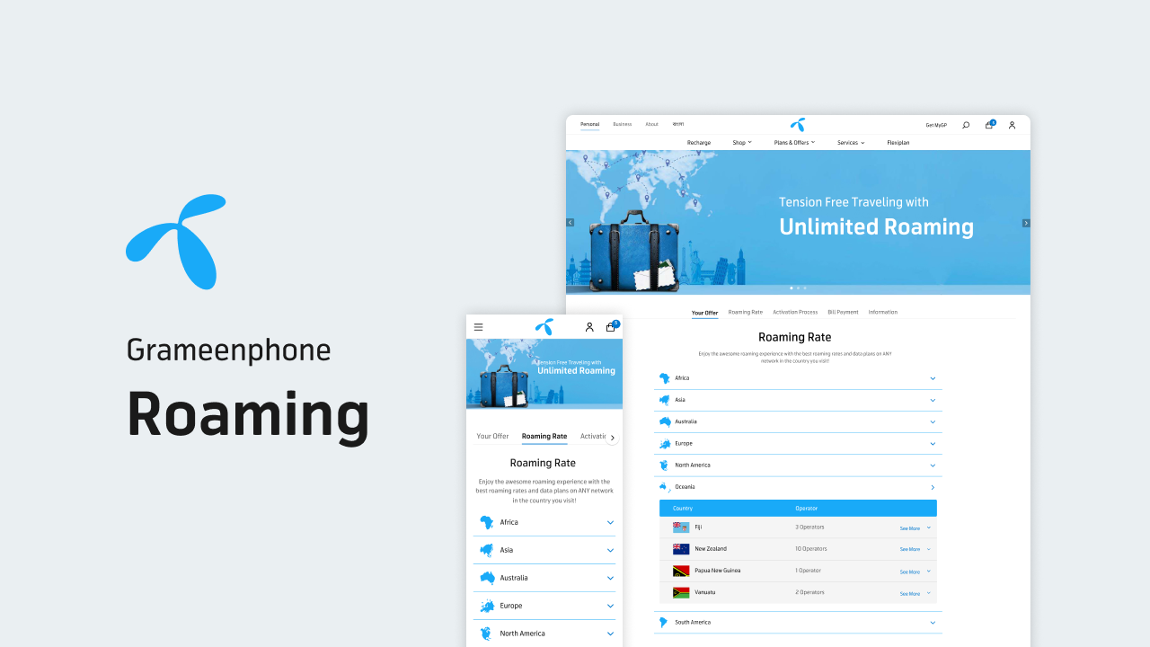
Grameenphone, widely abbreviated as GP, is the leading telecommunications service provider in Bangladesh, with 83.02 million subscribers (as of January 2022). It is a joint venture between Telenor and Grameen Telecom Corporation. Telenor, a telecommunication company from Norway, owns a 55.8% share of Grameenphone, Grameen Telecom owns 34.2% and the remaining 10% is publicly held.
Team
Lead by:
A.F.M Nazmus Sakib
Product Manager
Shougat Shee Shovo
UI & UX Manager
Developed by:
Sakil Imran, Argha Shipan, Abid, Sapan Kumar, Salman Rahman, Mehedi Hasan, Priya Saha
UI/UX Design
Saiful Islam Shihab (Myself)
Problem
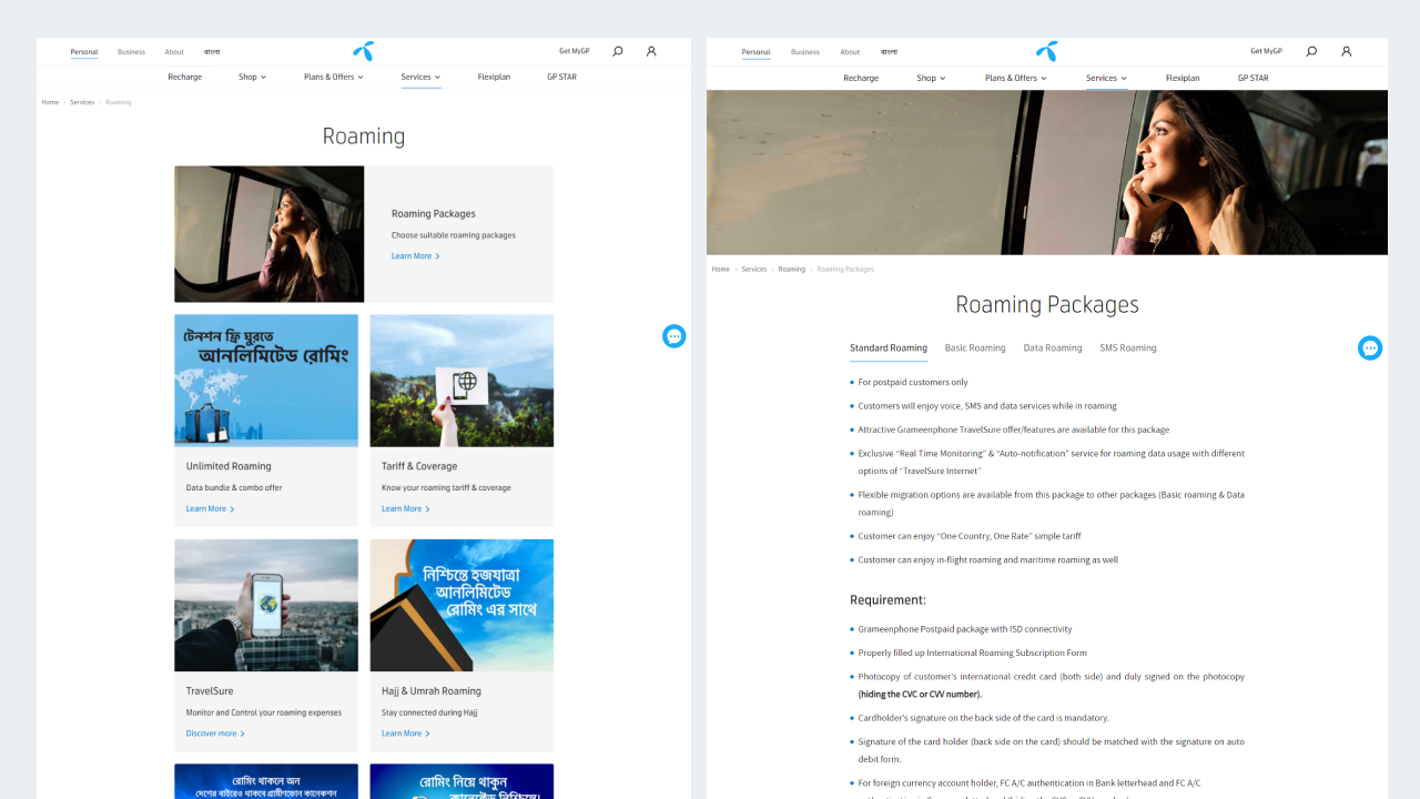
Grameenphone has a huge portion of their customers who use roaming while traveling overseas. And they frequently visit Grameenphones roaming page. There is a problem in the page, finding information is very hard. So as UI/UX designer my job was to redesign the page and make the finding information easier for users.
Previous Design
Competitive Analisis
For better understanding I have analized all local competitors of Grameenphone.
For better understanding I have analyzed all local competitors of Grameenphone. I also have gone through international telecommunication sites like T-mobile, at&t etc. While analyzing those sites I surprisingly realized that non of those company organized their roaming page properly, they just dumped all the information.

Opportunity:
Because non of the competitors organized their roaming page we had a great opportunity.
Make the data easily eccesible.
Opportunity:
Because non of the competitors organized their roaming page we had a great opportunity.
Make the data easily accessible.
Compress data to reduce cognitive load.
Set proper hierarchy and information architecture.
Make UI visually intuitive.
Make step by step activation process.
There are many more aspects we can cover.
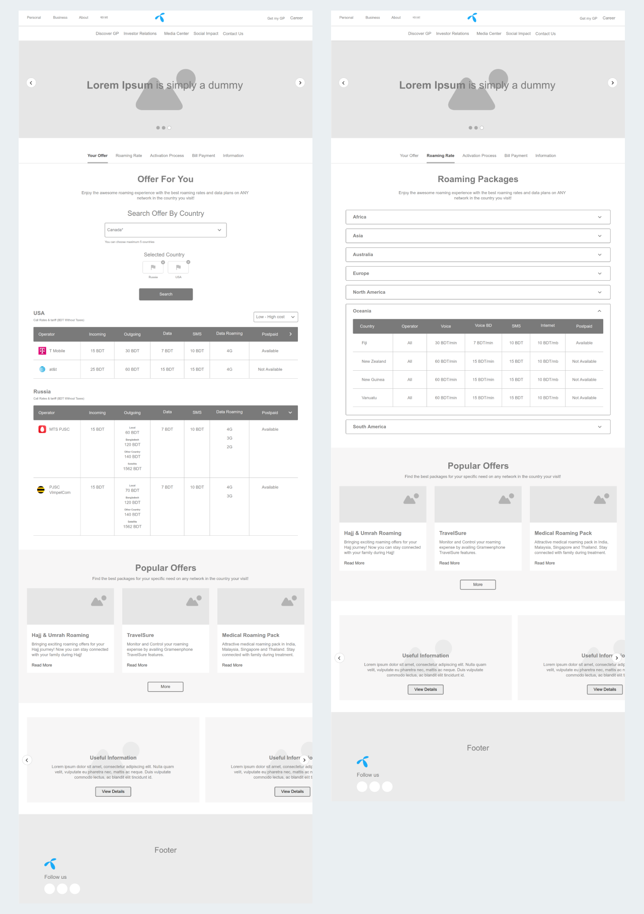
Wireframes
Improvement
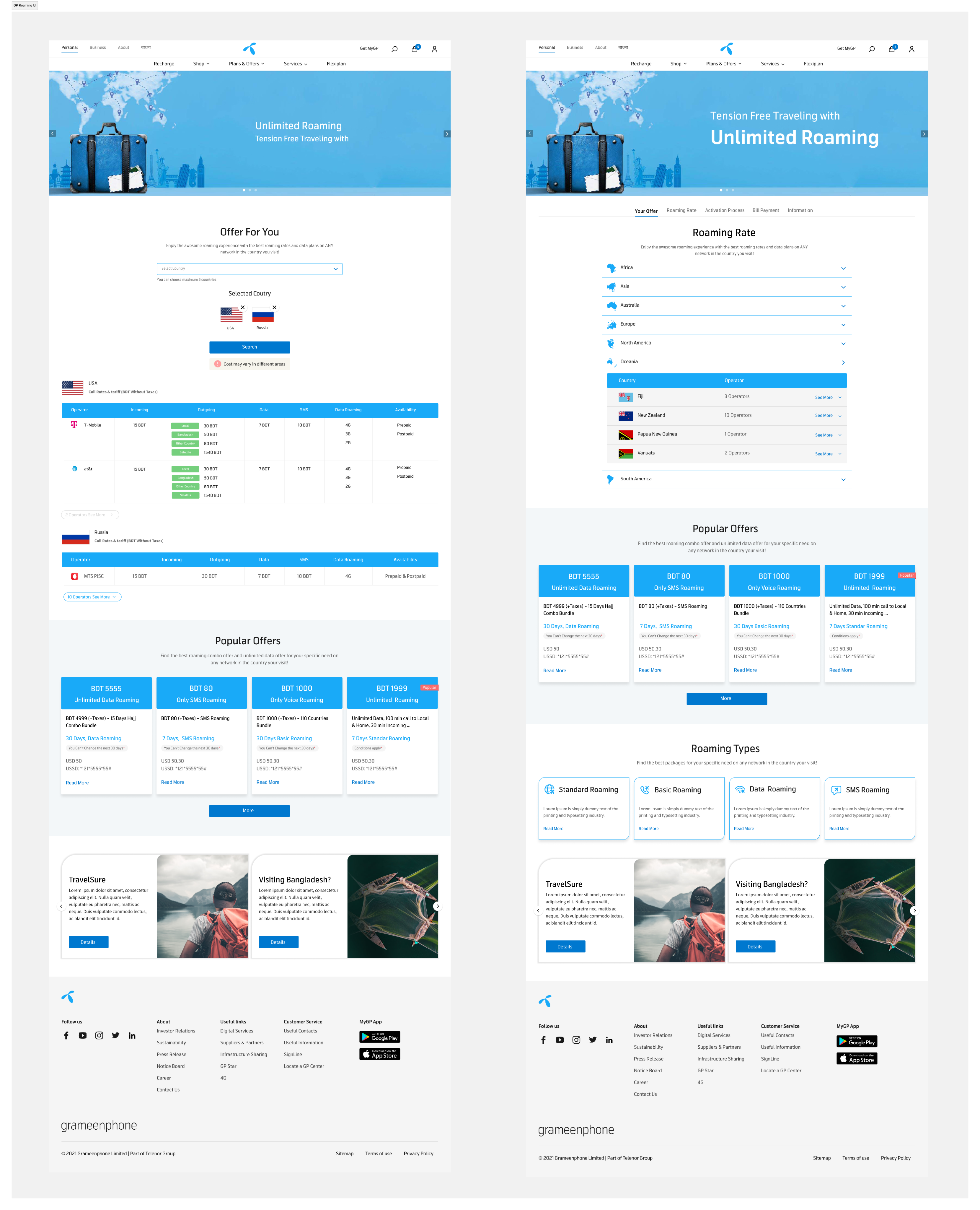
- Introduced ‘Tab’ on top to improve navigation and help user find information easily.
- Compressed information to reduce cognitive load. Ex. for roaming rate every company used generic table, that made skimming information from hundreds of country very hard. We introduced colupsible list
- Set proper hierarchy and information architecture.
- Make UI visually intuitive.
- Make step by step activation process.
Impact
Thousands are using this page from grameenphone.com every month.

Grameenphone, widely abbreviated as GP, is the leading telecommunications service provider in Bangladesh, with 83.02 million subscribers (as of January 2022). It is a joint venture between Telenor and Grameen Telecom Corporation. Telenor, a telecommunication company from Norway, owns a 55.8% share of Grameenphone, Grameen Telecom owns 34.2% and the remaining 10% is publicly held.
Team
Lead by:
A.F.M Nazmus Sakib
Product Manager
Shougat Shee Shovo
UI & UX Manager
Developed by:
Sakil Imran, Argha Shipan, Abid, Sapan Kumar, Salman Rahman, Mehedi Hasan, Priya Saha
UI/UX Design
Saiful Islam Shihab (Myself)
Problem
Grameenphone has a huge portion of their customers who use roaming while traveling overseas. And they frequently visit Grameenphones roaming page. There is a problem in the page, finding information is very hard. So as UI/UX designer my job was to redesign the page and make the finding information easier for users.
Previous Design
Competitive Analysis
For better understanding I have analyzed all local competitors of Grameenphone. I also have gone through international telecommunication sites like T-mobile, at&t etc. While analyzing those sites I surprisingly realized that none of those companies organized their roaming page properly, they just dumped all the information.
Opportunity:
Because none of those competitors organized their roaming page we had a great opportunity.
- Make the data easily accessible.
- Compress data to reduce cognitive load.
- Set proper hierarchy and information architecture.
- Make UI visually intuitive.
- Make step by step activation process.
There are many more aspects we can cover.
Wireframes
Improvement
- Introduced ‘Tab’ on top to improve navigation and help user find information easily.
- Compressed information to reduce cognitive load. Ex. for roaming rate every company used generic table, that made skimming information from hundreds of country very hard. We introduced collapsible list to find information easily.
- Used visual elements to reduce cognitive load more and make UI intuitive. Ex. used flags to find a country more easily without searching the country name or used illustrations on step by step activation process.
Impact
Thousands are using this page from grameenphone.com every month.